 FigureCheck
CSV plotting
Create a scatter plot from CSV data online
Turn a CSV, TSV, or Excel table into a labeled scientific scatter plot, then check the data mapping before exporting the result.
Hands-on example
Try this in FigureCheck
Open a realistic tabular dataset, confirm X and Y, and create a labeled scatter plot.
Opens a small synthetic dataset with a step-by-step guide in a new editable session.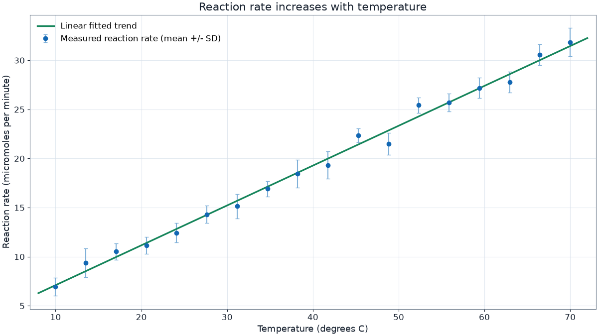
Structure the data before plotting
Keep one variable per column and one observation per row. Put short, unique column names in the first row. A useful table might contain Time, Temperature, Temperature uncertainty, and Treatment. Avoid merged cells, decorative headings, totals, and notes inside the measurement area.
CSV stores values as plain text, so check decimal separators, missing-value markers, and units after import. FigureCheck also opens TSV and XLSX files when those formats preserve the table more reliably.
Assign X, Y, and uncertainty
- Open the data file and inspect the spreadsheet preview.
- Choose the independent variable as X and the measured response as Y.
- Select an uncertainty column only when every value has a defined scientific meaning.
- Use a category column to split observations into meaningful series.
FigureCheck updates the graph without modifying the original file. See Prepare data and build series for multiple Y columns and grouped data.
Check before downloading
- Confirm that no column was interpreted as the wrong axis.
- Include quantity names and units in both axis labels.
- Inspect missing values and unusually distant points rather than silently deleting them.
- Choose final dimensions before judging text, markers, or legend size.
Continue with scatter plots and error bars or the publication-ready figure checklist.