 FigureCheck
Scatter plots and uncertainty
Create a scientific scatter plot with error bars
Show the relationship between two measured variables while making the uncertainty and meaning of every point clear.
Hands-on example
Try this in FigureCheck
Compare a scatter plot with an error-bar plot using the supplied uncertainty column.
Opens a small synthetic dataset with a step-by-step guide in a new editable session.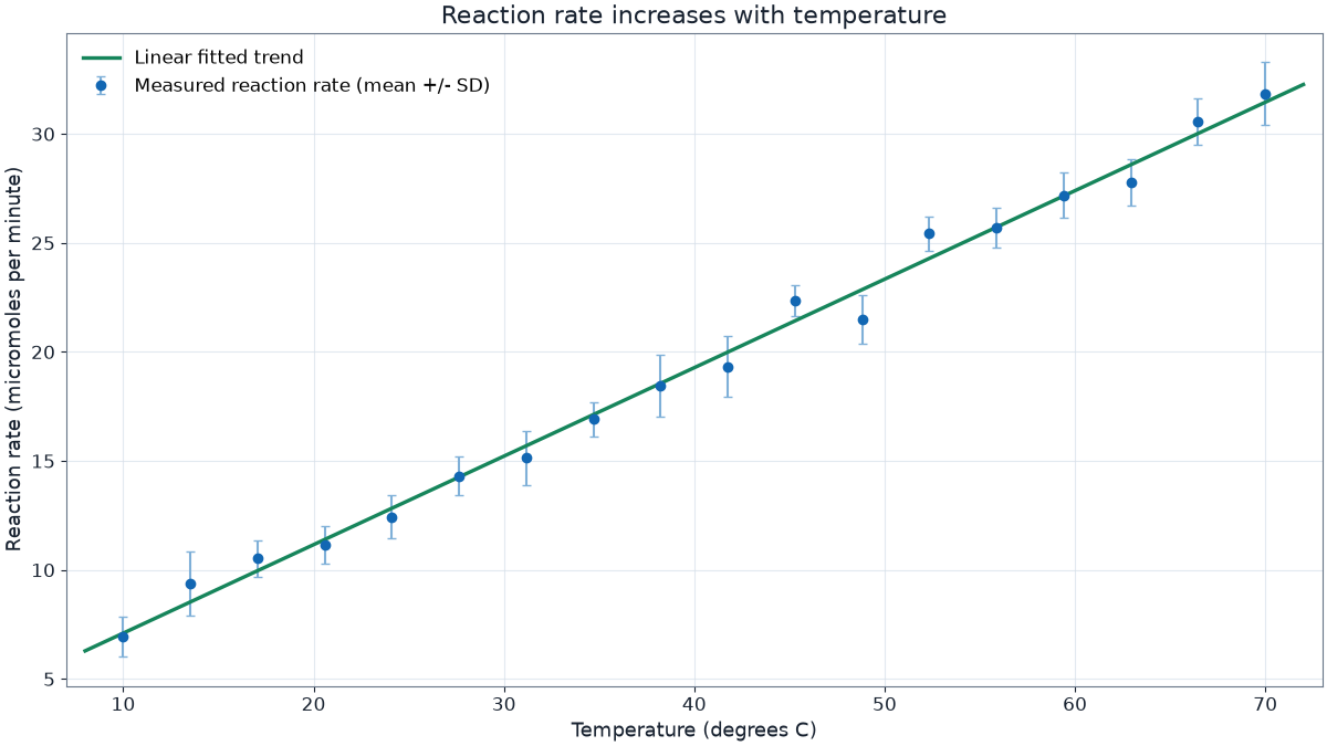
When a scatter plot is appropriate
Use a scatter plot when every marker represents a paired X and Y observation. Do not connect points unless their order is meaningful, such as measurements collected through time or increasing concentration.
Choose axis limits that show the data without implying a stronger or weaker relationship. Starting at zero is not required for a scatter plot, but any restricted range should remain visually honest and clearly labeled.
Choose the correct uncertainty
- Standard deviation (SD) describes the spread of observations.
- Standard error of the mean (SEM) describes uncertainty in an estimated mean and becomes narrower as sample size increases.
- A confidence interval gives a range produced by a stated procedure, commonly a 95% interval.
SD, SEM, and confidence intervals answer different questions. Name the quantity in the caption or legend rather than labeling every one as simply "error."
Build it in FigureCheck
- Select the independent measurement as X and the response as Y.
- Select the column containing Y uncertainty under Error bars.
- Use color groups only when the categories represent a real comparison.
- Export and inspect marker, error-bar, and label visibility at the final size.