 FigureCheck
Choosing a graph type
Scatter plot or line graph: which should you use?
Choose between points and connected lines by asking whether the observations are independent measurements or an ordered continuous sequence.
Hands-on example
Try this in FigureCheck
Switch the same ordered measurements between Scatter and Line to inspect what connecting points implies.
Opens a small synthetic dataset with a step-by-step guide in a new editable session.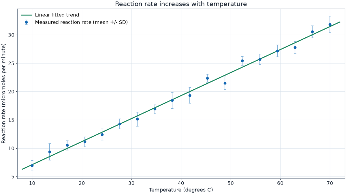
Use a scatter plot for measured relationships
A scatter plot shows each observed X-Y pair without claiming what happened between measurements. It is usually the safest choice for calibration data, correlations, repeated samples, and experiments where X values were tested independently.
A fitted curve is different from joining the points. A fit expresses a model supported by assumptions; point-to-point lines merely follow the measurement order.
Use a line graph for a meaningful sequence
Connect points when order itself carries information, such as a time series, a continuously sampled sensor trace, or cumulative progress. Sort the X values first. A line that doubles back because rows are unsorted can suggest behavior that never occurred.
Do not connect unrelated categories or measurements collected from different subjects merely because they appear in adjacent rows.
A practical decision rule
- If the space between observations is unknown, start with scatter.
- If the path and order are observed or scientifically meaningful, consider a line.
- If you need a model, keep the points visible and add a justified fit.
- If uncertainty differs by observation, use error bars with either appropriate presentation.
Read how to choose a curve fit before replacing raw observations with a smooth line.